One prompt isn't enough. The anatomy of a winning ad.
There is a misconception right now that using AI in design means typing "Make me a Facebook ad" and hitting enter.
If you do that, you get generic images that nobody clicks on.
To actually win a creative round, you have to stop "prompting" and start "workshopping."
Here is the breakdown of a recent concept we shipped for a gig-economy client (think "Uber for cleaners") that actually won the round.
1. The strategy (Before AI enters the workflow)
The brief was simple: Acquire people to work cleaning jobs.
We know from historical data that for this audience, money talks. The creative needs to be about getting paid, and it needs to communicate that in under one second.
We started in FigJam with a piece of inspiration.
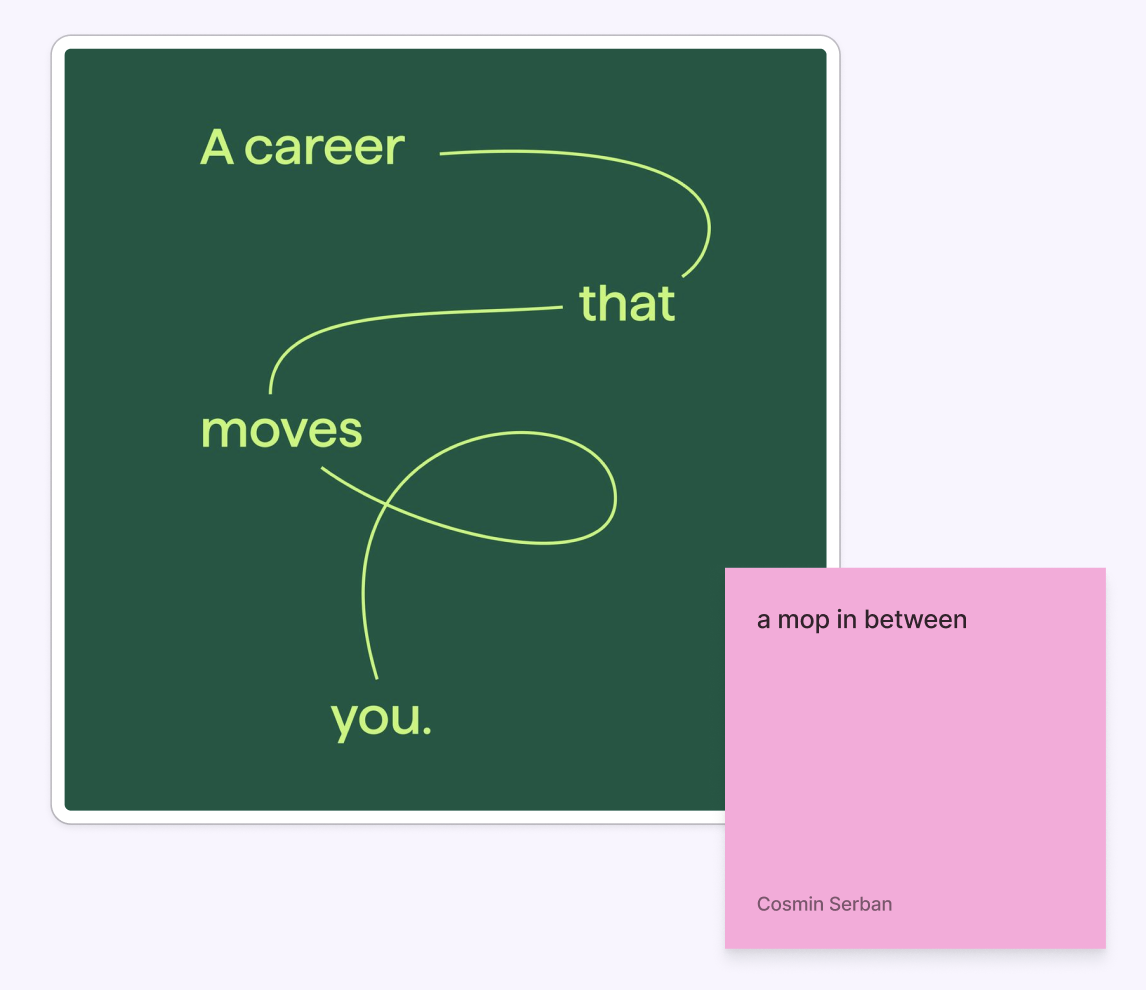
We really liked the basic design psychology (F-Pattern reading): Since people read Left-to-Right, the most important hook needed to be in the top-left corner.
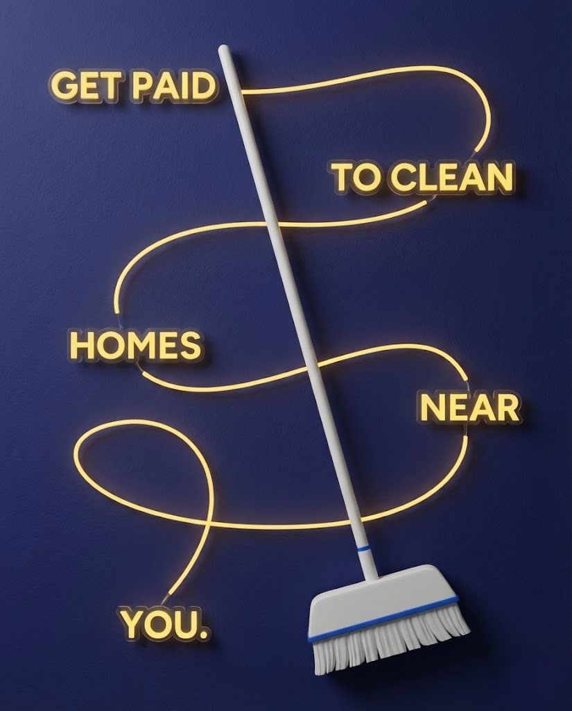
The copy: GET PAID - TO CLEAN - HOMES - NEAR - YOU.
Then, one of our visual designers actually created the foundation for this ad following the inspiration.
.png)
2. The Texture (Enter AI)
We’ve seen that static ads placed in "real environments" tend to perform better than flat graphics. They feel tangible. They stop the scroll.
We decided to turn this map concept into a Neon Sign mounted on a brick wall. High contrast, on-brand colors, and gritty texture.
We used Gemini to generate the base layers. But the initial results? It lacked weight and texture.
3. The Polish (The Human Touch)
This is where the art direction kicks in. We didn't settle for the first generation. We started refining the details that trick the brain into thinking an image is real.
We didn't just ask for "neon." We asked for:
- Metal brackets mounting the sign to the wall (to give it physical depth).
- Light spill reflecting off the brick texture.
- Cabling logic: We adjusted the yellow wires to weave above and below the broom handle, so it felt physically connected.
- External light sources to create realistic shadows.
These small tweaks—the brackets, the cables, the shadows—are the difference between a "cool AI image" and a high-performing ad.
_12.15.25_pm%20(1).jpg)
4. The Motion
Once the static concept won, we moved to video.Because we knew "GET PAID" was our anchor, we animated the neon to flicker that phrase on first. We used the light itself to direct the user’s eye.
The takeaway
The internet would have you believe we are heading toward a future where one prompt solves everything. We’re not there yet.
There is a massive difference between "one-shotting" a prompt and workshopping a concept.AI provided the texture and the lighting.
But it didn't know that "GET PAID" needed to be top-left.
It didn't know how to route the cables so they looked realistic.
It didn't know the brand strategy.
That came from us.
The tools are changing, but the taste required to use them hasn't changed at all.


Related Article
Pearmill Wins A Silver Drum Award
Related Article
June 17 Webinar

The author